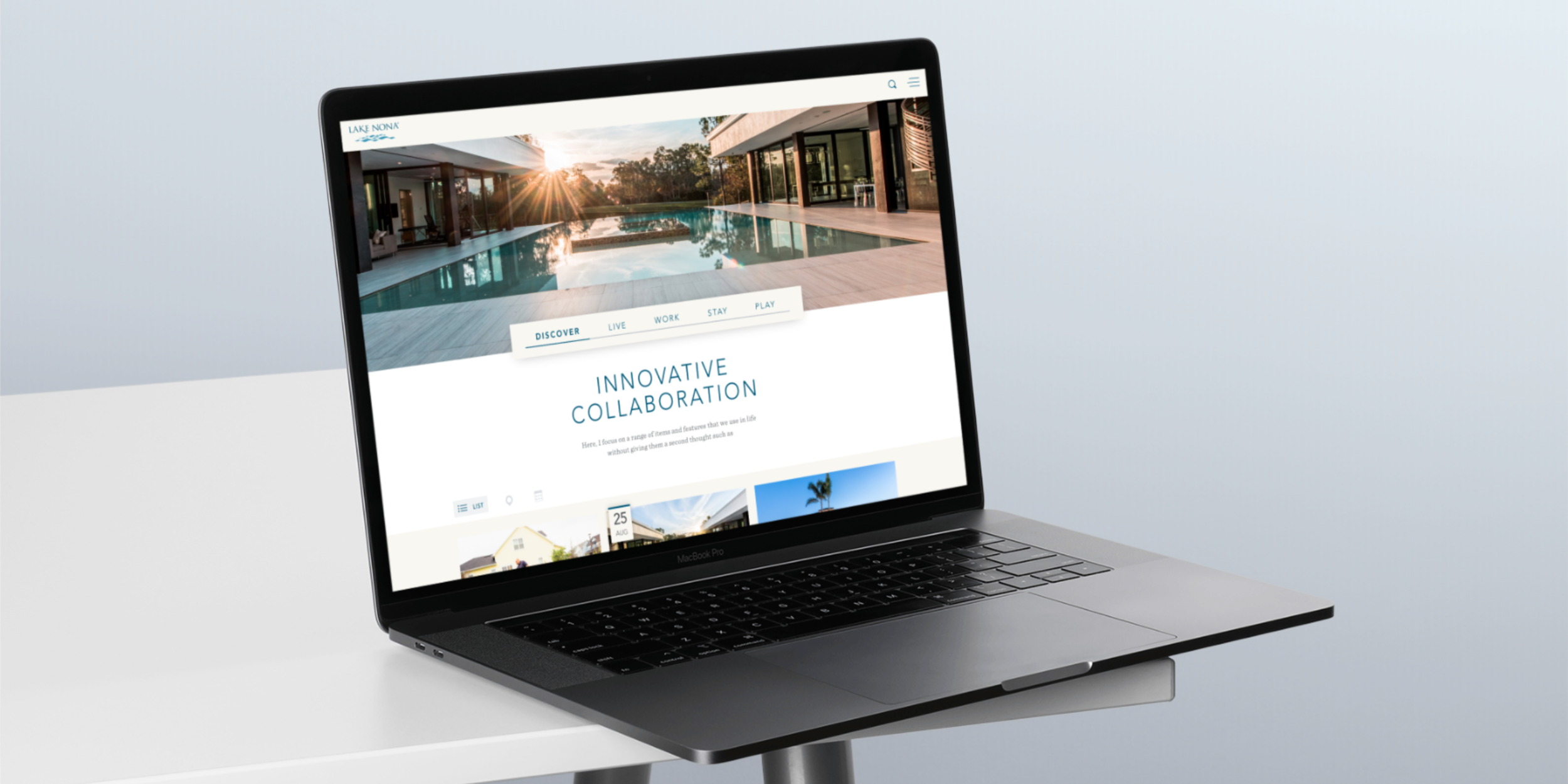
Lake Nona Website
UI / Visual Design

OVERVIEW
Lake Nona approached us looking for a website that would load content dynamically based on the way the user interacts with the website while giving the user an organic and unique experience.
UI / Visual Design
Senior Designer / Michael Anderson
Creative director / Carmen Treffiletti
UX Designer / Grant Cavaluzzi
The Challenge
The challenge was to create a website that had dynamically loading content but did not feel repetitive. We also were challenged with making the site look beautiful regardless of what content was being loaded into our content blocks.
The Solution
The solution was to create a looping template of UI cards that are all uniquely designed. This gives the feeling of looking at something new with each new page load. The layout never changes, but all the content does.
The slider located on the home page was designed as a top-level filter. Its main function is to filter out unwanted content, but also provides useful user data on how to better serve targeted articles, events, home listings, etc.
Created at 321 the Agency as a full time employee


